Hotels, Resorts & Guest-Focused Interiors
The most memorable hotels do more than provide a comfortable place to stay. They create a feeling that belongs specifically to that location. From the first view of the lobby to the artwork inside a guest room, every visual decision contributes to the story a property tells.
Thoughtfully selected hospitality artwork for hotels and resorts can help a property feel connected to its surroundings, architecture, and brand identity. A dramatic mountain photograph may reinforce the character of an alpine lodge, while atmospheric coastal imagery can give a waterfront hotel a quieter and more authentic sense of place.
The goal is not simply to fill empty walls. The strongest hospitality artwork helps guests understand where they are, how the property wants them to feel, and what makes the experience different from a hotel anywhere else.
What “sense of place” means in hospitality design
A sense of place is the feeling that a hotel could only exist where it does. It can come from architecture, materials, landscaping, lighting, local history, food, views, and the way guests move through the property. Artwork becomes one of the most visible ways to connect those elements.
This does not mean every hotel needs literal photographs of its nearest landmark. A coastal property can suggest the ocean through mist, weathered textures, tidal movement, or muted blues and grays. A mountain lodge can reference altitude and wilderness through black-and-white peaks, changing seasons, old structures, forests, or expansive skies.
The best selections feel specific without becoming predictable. Guests recognize the atmosphere of the region, but the artwork still feels considered, elevated, and integrated with the interior.
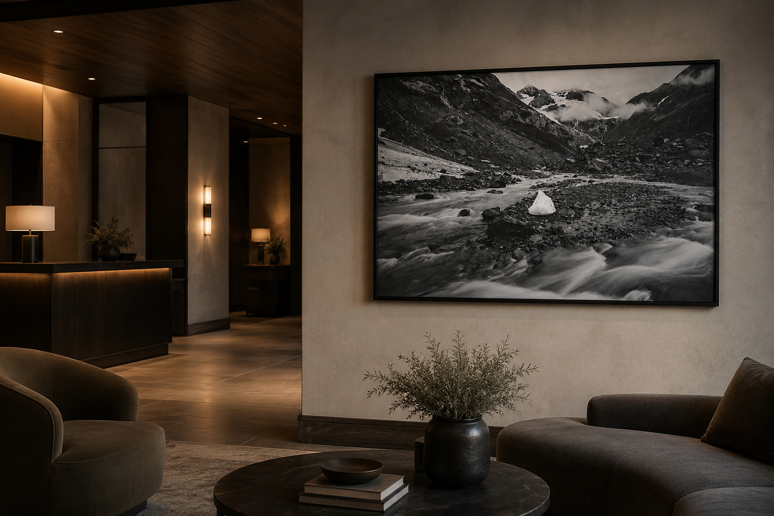
The arrival experience begins before check-in
The lobby is often the most photographed and remembered interior in a hotel. It introduces the property’s visual language before a guest reaches the front desk. Artwork in this setting needs enough scale and presence to compete with architecture, lighting, furniture, and movement.
A small piece centered on a large wall can feel apologetic. One oversized focal image, a well-spaced diptych, or a coordinated grouping usually communicates more confidence. The work should be visible from the natural path of entry, not hidden behind furniture or placed where guests only notice it while leaving.
Arrival spaces also benefit from clarity. The artwork does not need to explain every part of the brand. It needs to establish the emotional direction: dramatic, calm, adventurous, refined, historical, coastal, urban, or restorative.
Design question to ask
What should a guest feel during the first thirty seconds: energized, reassured, curious, grounded, transported, or impressed? That answer should guide the scale and subject of the first major artwork.
Use regional artwork without making the hotel feel themed
Regional artwork can become overly literal when every image depends on recognizable landmarks, maps, slogans, or tourist imagery. A stronger approach is to build a collection from the broader character of the destination.
For a mountain property, that might include mist, rock, water, timber, wildlife, snow, working landscapes, and quiet black-and-white scenes. For a waterfront hotel, it might include harbor reflections, marine weather, coastal forms, historic structures, and the rhythm of docks or boats.
These subjects create geographic identity while giving the designer enough flexibility to coordinate the art with the interior palette. They also help repeat guests discover details over time rather than absorbing the entire concept at once.
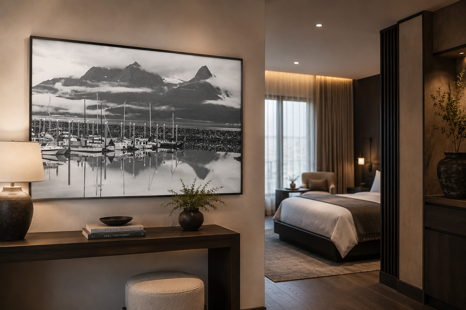
Create a guest journey, not a collection of unrelated walls
The lobby may introduce the story, but the artwork throughout the property determines whether that story continues. Corridors, elevator landings, guestrooms, restaurants, meeting rooms, and quiet seating areas should feel related without repeating the same visual solution.
A practical way to create continuity is to establish a small group of shared rules. The collection might use one frame finish, a controlled palette, a consistent photographic style, related subject matter, or a gradual change in mood from public to private spaces.
Public spaces often support larger scale and stronger contrast. Corridors need artwork that reads quickly from a distance and creates visual rhythm. Guestrooms generally benefit from calmer imagery that rewards longer viewing without competing with rest.
- Lobby and reception: larger focal pieces with immediate presence.
- Corridors: repeated scale, spacing, or framing that guides movement.
- Guestrooms: quieter imagery with warmth, depth, or local connection.
- Restaurants and bars: stronger color, energy, history, or conversation value.
- Spas and wellness areas: water, mist, forest, open space, and restrained contrast.
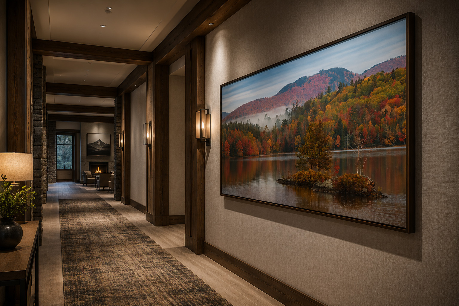
Guestroom artwork should feel distinctive without preventing rest
Guestrooms are where hospitality artwork is experienced for the longest period of time. The work needs enough personality to keep the room from feeling generic, but it should not dominate every quiet moment.
Atmospheric landscapes, subtle seasonal color, minimal compositions, soft water, distant mountains, and restrained black-and-white imagery tend to work well because they offer depth without visual noise. The selection can still feel regional, but it should support the room’s primary purpose: comfort and restoration.
Scale matters here too. A single larger piece often feels more intentional than several undersized images. The artwork should relate to the headboard, console, seating area, or architectural opening rather than simply occupying whatever wall remains.
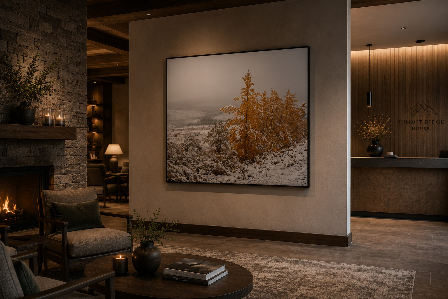
Match the artwork to the property’s personality
Hospitality is not one visual category. A downtown boutique hotel, a mountain lodge, a wellness retreat, a conference hotel, and a family resort may all need completely different artwork even when they share a similar budget or level of finish.
A rustic lodge can support weathered buildings, broad landscapes, wildlife, forests, and mountain history. An urban restaurant may need color, graphic energy, local architecture, or a recognizable social landmark. A luxury resort may lean toward quieter, more abstracted landscapes with elegant scale and consistent presentation.
The artwork should extend the brand rather than force the property into the artist’s preferred style. That is why project-specific curation is valuable: the collection begins with the property’s architecture, palette, location, and guest experience.
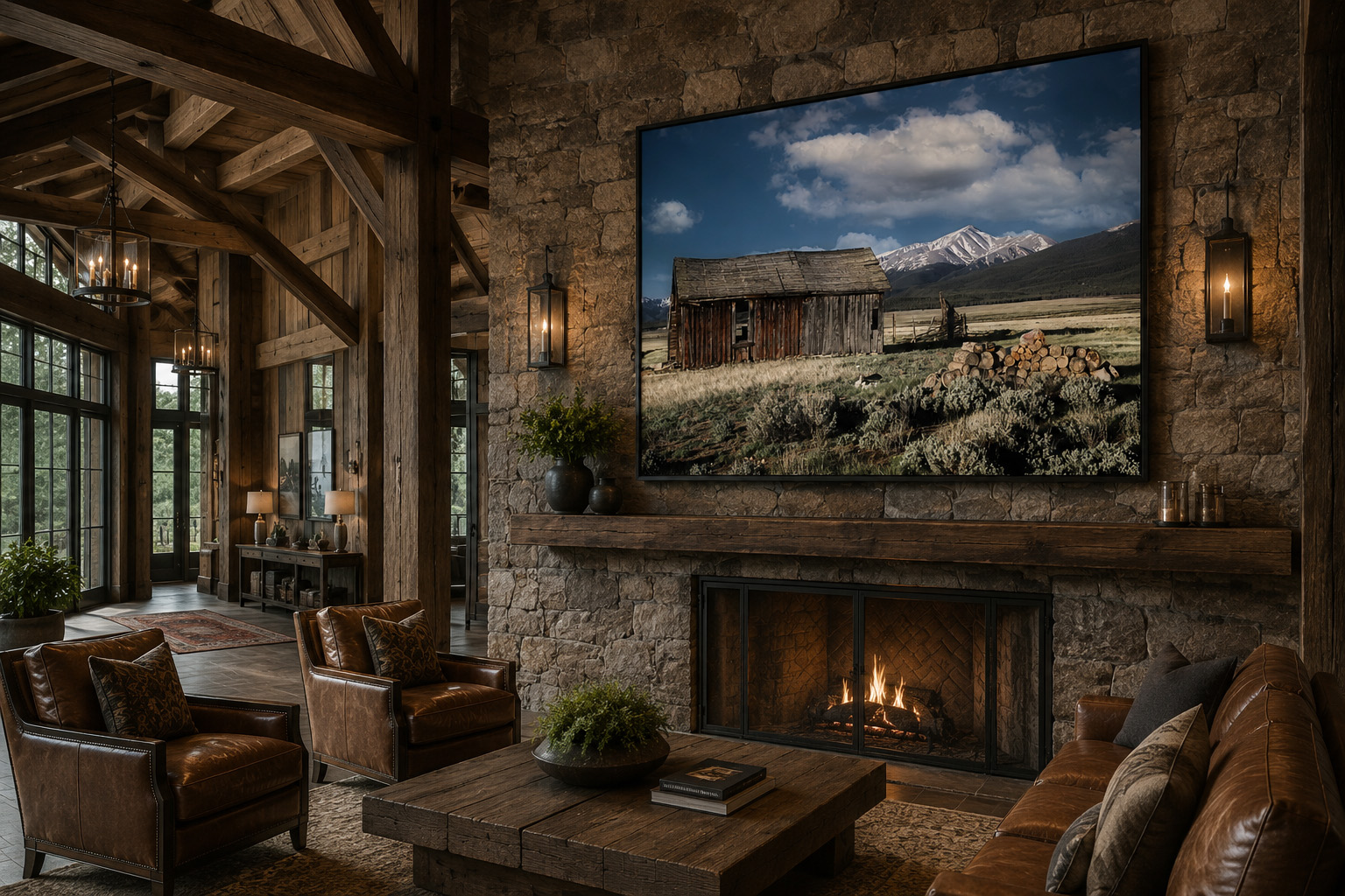
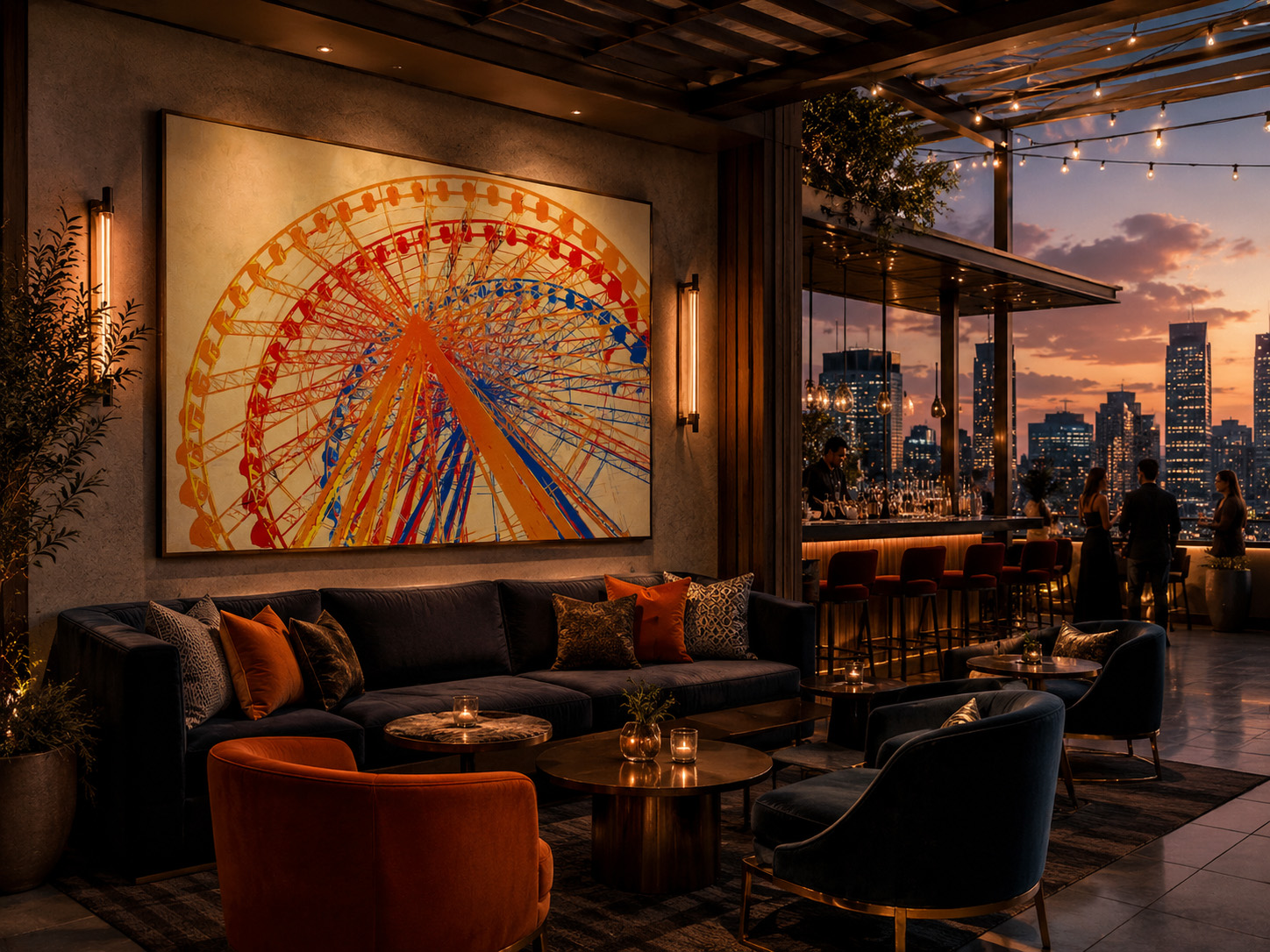
Artwork can make restaurants, bars, and gathering spaces more memorable
Hospitality artwork is not limited to guestrooms and lobbies. Restaurants, bars, rooftop lounges, private dining rooms, and meeting spaces often offer the best opportunity for stronger personality.
These areas benefit from artwork with conversation value. The image might reference a local landmark, regional history, changing seasons, entertainment, transportation, or the property’s relationship with the city. In the right setting, bold color can become part of the social identity of the venue.
The artwork should still be visible under actual operating conditions. Dark walls, evening lighting, reflective surfaces, and crowded furniture arrangements all affect how a piece reads. A mockup or elevation study can help determine whether the planned size, brightness, and placement are strong enough.
Why project-specific curation matters
A large artwork archive provides variety, but searching thousands of images can be inefficient for a busy designer, owner, or procurement team. Project-specific curation narrows the selection to the property’s location, palette, scale, mood, and intended guest experience.
A useful curation process can include:
This approach protects the designer’s time while helping the property avoid generic art packages that could appear in any market. The final result feels more connected, memorable, and intentional.
Final thoughts
A memorable hotel experience is built from many small decisions, but artwork is one of the few elements that can communicate location, emotion, history, and brand identity at the same time.
When selected with intention, hospitality artwork can make a lobby feel established, give a corridor purpose, make a guestroom less generic, and turn a restaurant or lounge into a recognizable destination. The strongest collections feel coordinated but not repetitive, regional but not themed, and visually impressive without losing their connection to the guest experience.
For hotels, resorts, lodges, restaurants, and hospitality designers seeking original nature photography and project-specific guidance, explore my hospitality artwork portfolio or contact me for a curated selection based on your property, palette, scale, and design direction.