How to choose calming, recognizable nature artwork for resident rooms, common areas, dining spaces, corridors, and memory care — with practical guidance on scale, placement, formats, and project mockups.
For residents, artwork isn't decoration — it's part of how a community feels like home, supports orientation, and shapes daily mood. For operators and designers, the right imagery also supports the "residential, not institutional" standard that today's communities are held to.
Recognizable natural scenes — forests, water, open fields, familiar seasons — read as calm and safe rather than sterile or clinical, easing the transition into a new living environment.
Distinct, varied imagery placed consistently at key points in a corridor or wing can help residents orient themselves, especially valuable in memory care settings.
Museum-quality prints signal that a community was designed with intention and care — for residents, for families touring the building, and for staff who spend their days there.
Every space in a community asks something different of the art in it. Here's how imagery is typically matched to use.
Smaller-format, personal-scale pieces that feel residential rather than corporate — a single calm landscape or water scene above a dresser or seating area, sized to the room rather than to a hallway.
Typically 16"–30" on the long edge, canvas or framed print.
Larger statement pieces that anchor a seating area and give residents and families a shared focal point — a wide landscape, a waterfall, or a series of two to three related images.
Good candidates for multi-piece sets or a single oversized canvas.
Warm, appetite-friendly palettes — golden hour landscapes, autumn color, soft water reflections — that make communal dining feel inviting rather than institutional.
Framed prints hold up well near food service traffic; metal prints wipe clean easily.
A consistent visual rhythm — a run of related images, evenly spaced — that softens long institutional hallways and gives residents visual landmarks as they move through the building.
Uniform sizing and consistent hang height across a corridor reads best.
Slightly more dynamic imagery — moving water, wildlife, seasonal variety — that supports conversation and engagement without becoming visually overwhelming.
Rotating or seasonal sets work well if a community wants variety over time.
These room mockups help designers and operators compare scale, placement, and atmosphere across corridors, dining rooms, common areas, and private resident rooms.
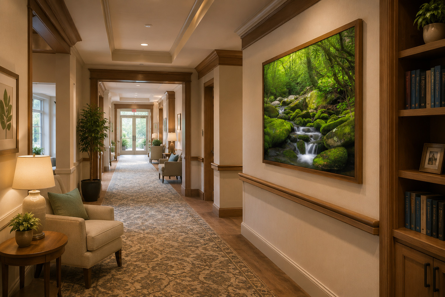
A large, recognizable nature scene creates a visual landmark while softening a long circulation space.
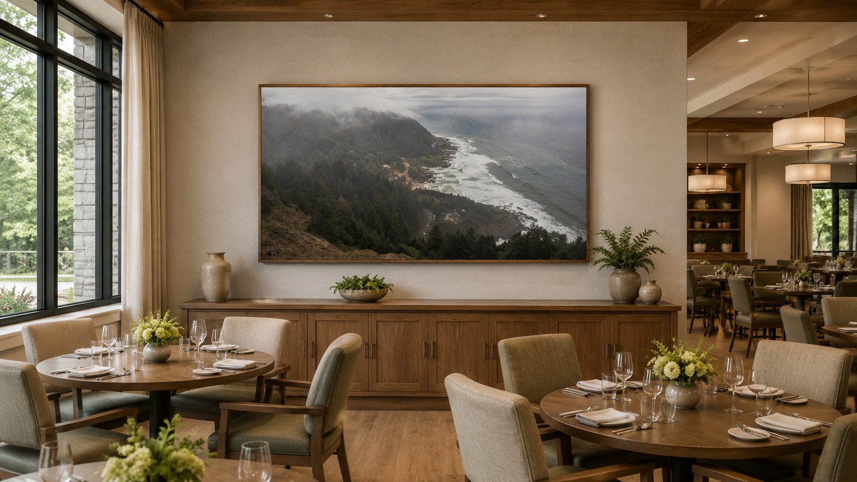
A broad horizontal composition anchors the room without competing with conversation or activity.
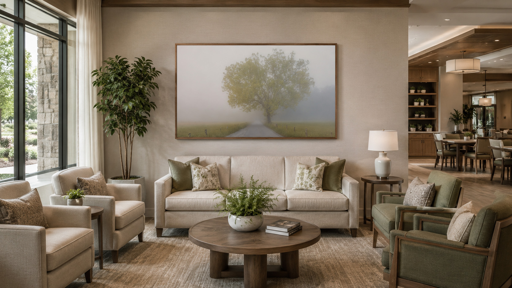
The single tree and road are easy to read from across the room and support a quiet residential atmosphere.
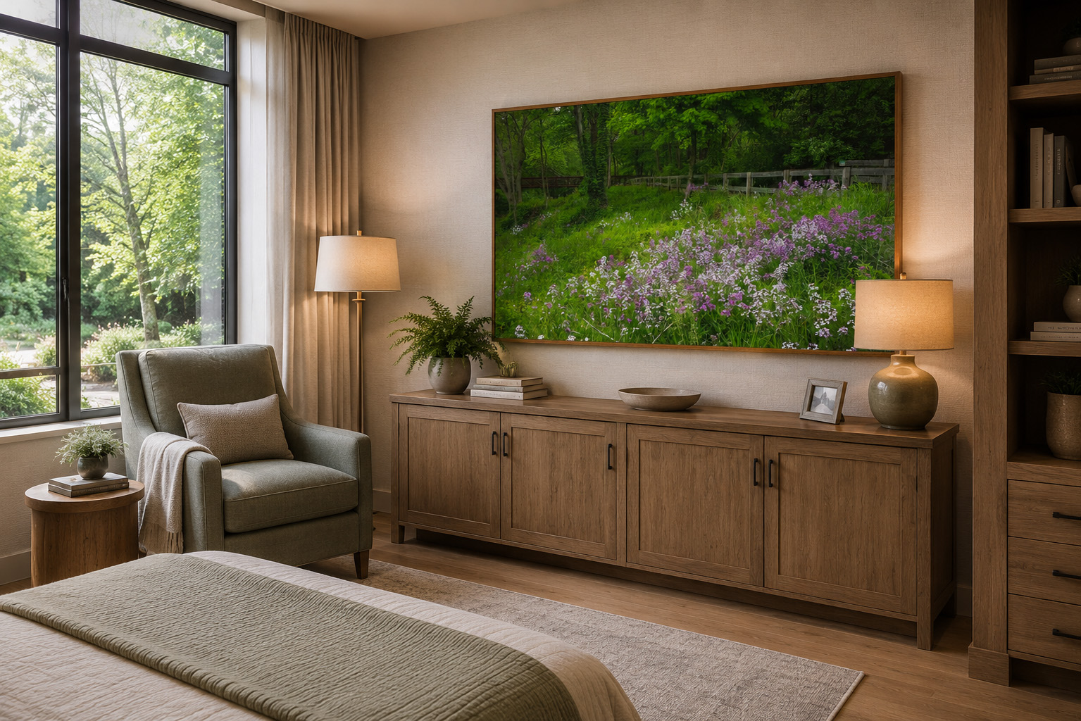
Familiar flowers and natural color add warmth while keeping the room calm and easy to live with.
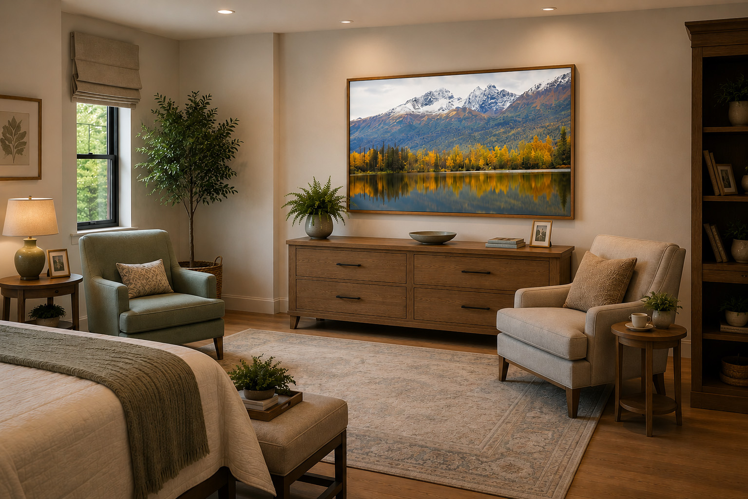
A spacious scenic view can give a resident room depth, seasonal warmth, and a strong connection to nature.
Conceptual room mockups: These images demonstrate artwork scale and design direction and are not presented as completed client installations.
In memory care specifically, imagery should be immediately legible — a resident should be able to recognize what they're looking at without effort. Clear, representational nature scenes (a single waterfall, a calm shoreline, an open meadow) generally serve residents better than abstract compositions, high-contrast graphic work, or busy multi-subject images, which can read as confusing or disorienting rather than calming.
Consistent placement also matters more here than elsewhere in a community — the same image, in the same spot, helps build a reliable visual landmark over time.
General guidance drawn from evidence-based design research on healthcare and senior living environments — not a substitute for a community's own clinical or design consultation for memory care programming.
Every format is available in custom sizing to match a community's finish palette and wall dimensions.
Warm, soft-edged, and lightweight — a residential feel for rooms and lounges.
The most traditional option; frame finish can be coordinated to a project's palette.
Durable and easy to wipe down — well suited to dining rooms and high-traffic corridors.
A polished, higher-end finish for lobbies and primary common areas.
Send a room photo, floorplan, or finish palette and get an artwork recommendation with a mockup preview — before committing to a piece or a size. Trade pricing and multi-piece project quotes are available.
Request a Mockup Trade Pricing & ResourcesRecognizable, representational nature imagery — landscapes, water, forests, and familiar seasonal scenes — generally works best. Abstract or ambiguous imagery can read as confusing, especially for residents with cognitive decline, while clear nature scenes support wayfinding, mood, and a sense of home.
Yes. Memory care design guidance generally favors realistic, easily identifiable imagery over abstraction, since residents rely on visual cues to orient themselves. Warm, familiar scenes — a forest path, a calm lake, a golden field — tend to support a sense of safety better than busy or abstract compositions.
Yes. Canvas, framed, metal, and acrylic prints are all available in custom sizing to match corridor widths, resident room walls, and common area scale, with frame finishes coordinated to a project's palette.
Yes. Trade pricing, multi-piece project quotes, and mockup previews are available for interior designers, architects, and senior living operators — start with a trade application on the For Designers page.